Google Data Studio
7 steps to optimize slow dashboards • Google Data Studio
Learn how to optimize slow dashboards and reduce loading time while interacting with sorting and filtering your data.
Filter by Category
Filter by Author

Learn how to optimize slow dashboards and reduce loading time while interacting with sorting and filtering your data.

Guide on how to create a Dynamic Profile in Google Studio. It is first to step to build Dynamic Creatives.

Learn how to improve HTML5 creatives loading performance and avoid common mistakes.

Learn how to track in Google Analytics a user who uses AdBlock.

How to estimate the invalid visits in the campaign reporting? Why this problem exists and how we could avoid report discrepences.

3 common problems with Google campaign reporting using Adobe Analytics. Why they happen and how we could improve reports quality. Introduction Adobe does not have official linking...

Google Campaign Manager has multiple options and settings. But there is one fascinating one. With this option, you will stop using Cookies for your campaigns.

Learn how you can create Google Floodlight segments in Google Search Ads 360.

Thousands of Google DV360 campaign visits, which are nowhere reported, and trigger DDoS attack alarms on the server firewall. Was it a DDoS attack, or something else?

How to enable campaign External ID setting under the Google Campaign Manager campaign? And why this option is so important?
Learn how to optimize slow dashboards and reduce loading time while interacting with sorting and filtering your data.
Contents
The building dashboard in Google Data Studio is straightforward and quick. But even with a simple dashboard using Google Analytics connector, we might notice that loading time for a result takes a relatively long time. And we did not even start joining data sources or creating custom calculation fields that significantly impact performance.
From a technical point of view, the server is under massive memory and CPU usage. More users use the dashboard, then slower overall performance might become.
From the development point of view, the longer we wait for data to load, the more time we spent on development and testing. Time is money.
From the user’s point of view, the longer the user waits for data to load, the less happy he is to use the dashboard.
There is no direct rule which defines that. But from my experience, if the loading time takes more than 3 seconds, many users might see this as slow.
Why more than 3 seconds? There are many studies regarding page speed and related to its user behaviors. And since Google Data Studio dashboards are also loading inside the browser, this might be taken as expected behavior. Impact of the page speed I’ve described in this article.
Of course, the advanced and very complicated dashboard might take more time due to the complexity, but those are exceptional examples.
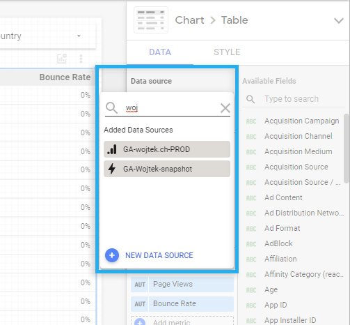
I’ve used a simple Google Analytics connector to display fundamental data on the dashboard in our example. Similar logic can be applied to Google DV360 and Google Ads connectors.
The reason why I’ve selected Google Analytics is that by default, it pulls all atomic event data (page visit, transaction, custom events) with all available dimensions and metrics.
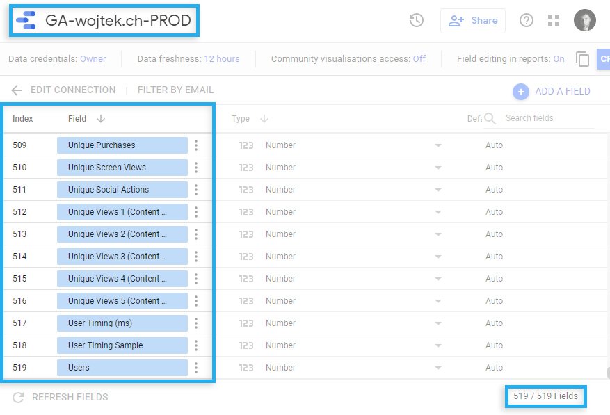
As you can see, we have 519 all available fields. And every time you pull data, Google Data Studio is pulling everything from your defined time range. It is many data. Easly 90% of those fields you don’t need to use in your dashboard.
Imagine you display aggregated daily base page views. The problem is that the Google Analytics connector sends to Google Data Studio atomic events. So Google Data Studio must count the sum of page views for each day. And if you have 1mln page views per day, Data Studio needs to aggregate 14mln page views from the last 14 days to display 14 rows and recalculate it every time you apply or change the filter.
This aggregation should be done in the data source, not on the dashboard.
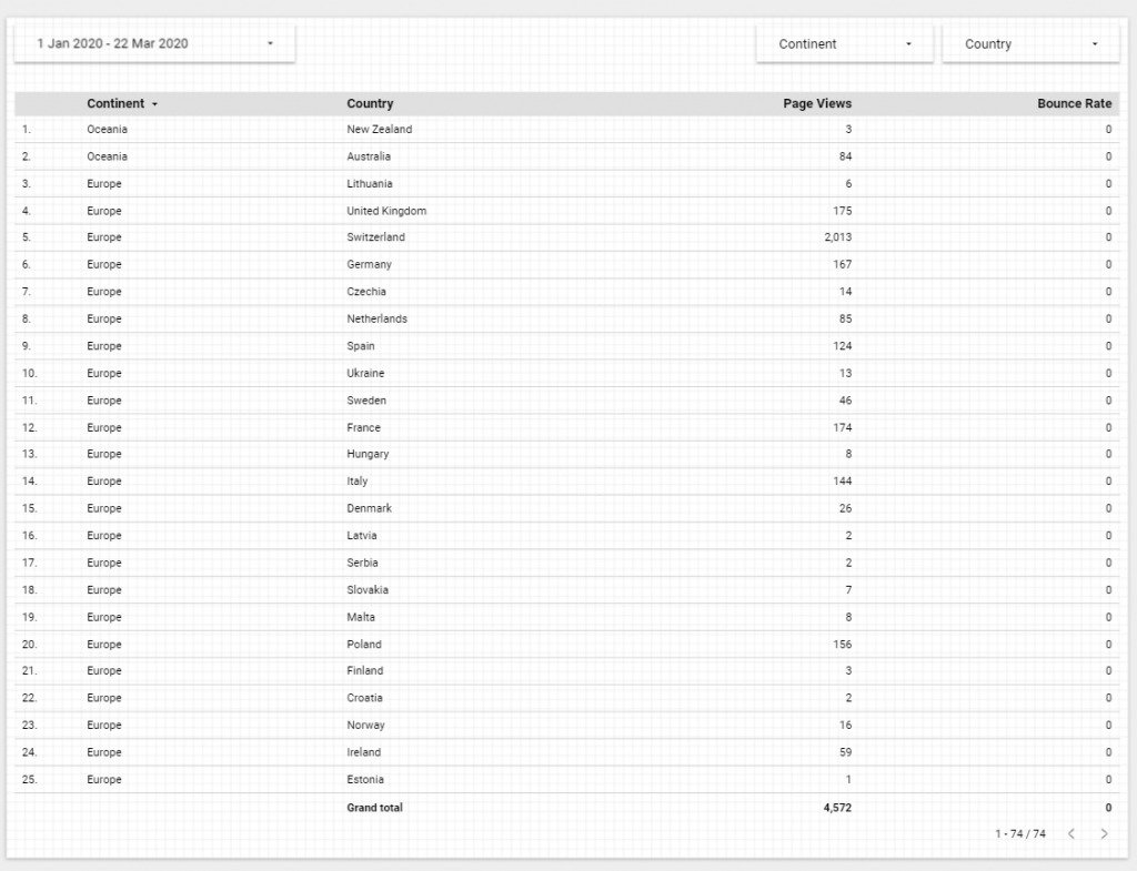
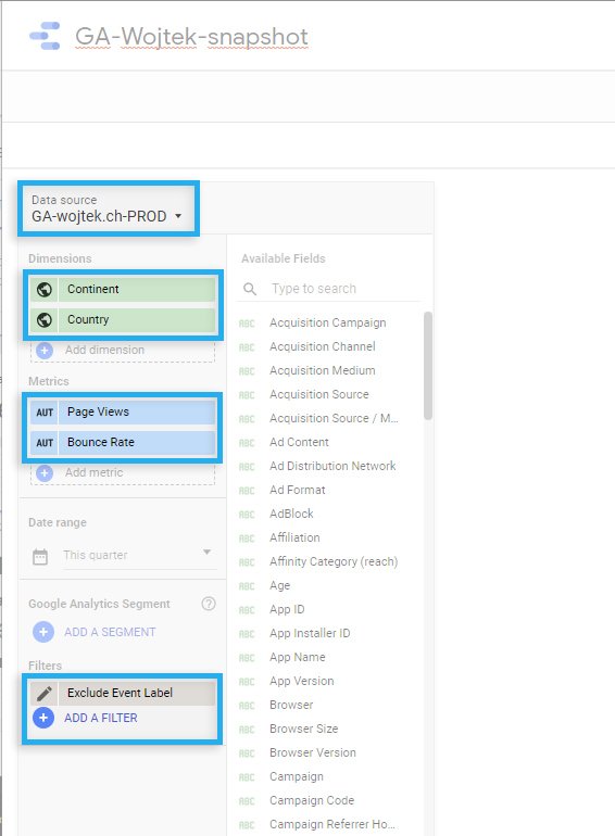
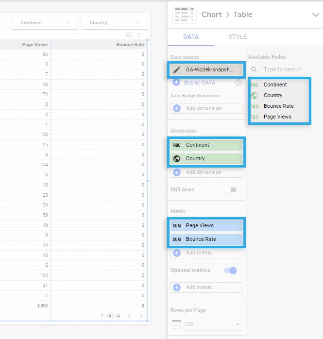
I’ve created a simple dashboard where we aggregate visits by continent, country, and compare Page Visits with Bounce rates from the last 4 months.
We use 4 out of 519 fields in the data source.
Let’s discuss what we could do to make things right. The steps below described a universal approach applied to other data source connectors that solve slow dashboards problems in the future.
Since we already have a Google Analytics connector that pulls all available data, we need to create an extract that will use our previously created connector but take only those dimensions and metrics we need for our dashboard.
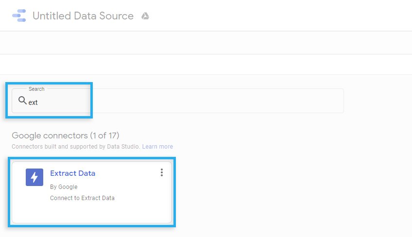
Under Data sources, we need to find a connector called “Extracted Data.”
Inside of the extract, we define the original data source, which, in our case, is previously created Google Analytics data source.
From the available fields list, we select only those fields we need to use in the dashboard.
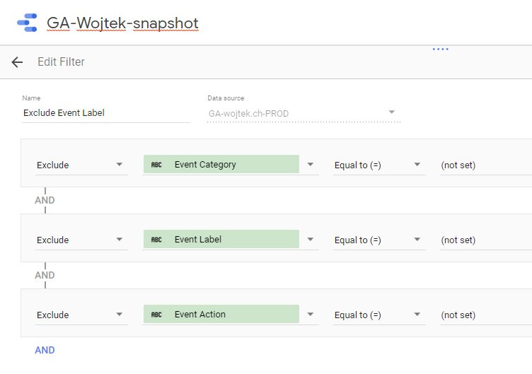
We can also define a filter, exclude unwanted data, or focus only on a small part of the data.
As an example filter, we exclude all Analytics events where the custom events were not empty. Why? I don’t know, and this is just an example : – )
It is an important part. Extract, by definition, should be small and quick.
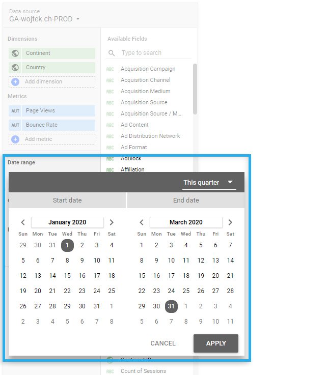
If you define the date range to the last 14 days, the extract will contain cached data from the last 14 days. And access to this data will be quick. But, if on the dashboard you allow the user to change the date and select the date range “last 30 days”. Our extract will not contain this data so that he will request those data from the original data source. And this will take a much more extended period.
Always put in the extract a bit more time overhead for the data.
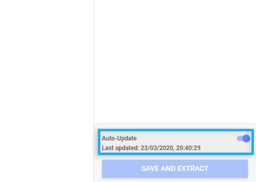
If we want our extract to auto-update as soon as the original data source receives data, you need to enable this function, which is disabled by default.
When the new data extract is ready in the dashboard, we can now replace data sources from the original one to the new one.
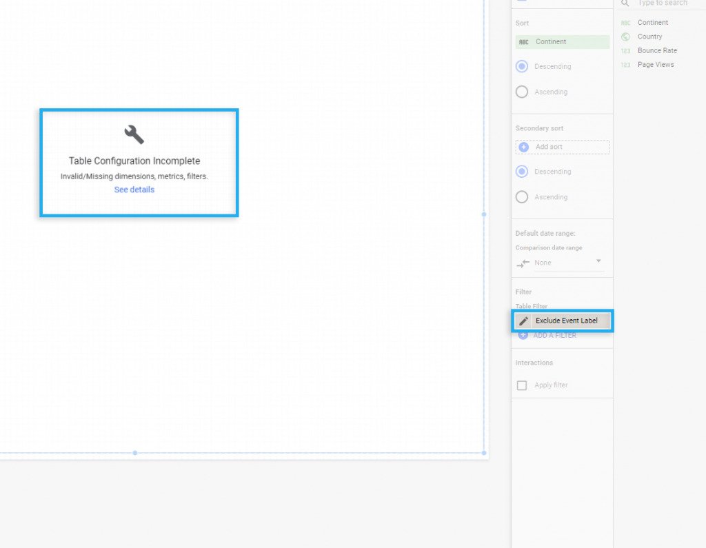
It might happen that you will see an error saying that some fields are missing and incomplete configuration.
Since we’ve restricted the fields list and moved data filters from the dashboard to the extract, we must remove the previously created filters from the dashboard.
After removing the filter from the dashboard, data will show instantly.
Instead of 519 available fields, we see just 4. Even if there is not that much data, we can notice that loading and switching between filters are noticeably quicker.
I’ve applied a similar approach to one of our client’s dashboards, where we need to make custom events and transaction calculations. After applying extract interaction, the time has changed from 10-20s to 1-2s. And this change is significant.
If you have any questions, please leave a comment, or contact me directly via LinkedIn 🙂


Subscribe to receive updates about new articles.


You are the real MVP
Thanks
Thank you! This article helped tremendously!